Design and Develop with
Speed, Flexibility, and Ease
Qbit provides a seamless collection of components that help developers build modern interfaces quickly. tts intuitive structure reduces complexity, allowing teams to focus on innovation rather than repetitive coding.
Design Philosophy
“Build With purpose, Design Without Limits.”
At Qbit, we focus on purposeful creation while giving you the freedom to design without limitations.
Revolutionizing UI Design with Clarity and Innovation
Qbit is revolutionizing the way developers build user interfaces with its cutting-edge Component-Based MVP Architecture—a proven, industry-leading approach that prioritizes clarity and scalability. By effortlessly separating logic from presentation, Qbit enables developers to craft clean, maintainable, and future-ready applications. With Qbit, turning bold ideas into intuitive and adaptable digital experiences has never been easier—or more enjoyable.

Unleashing Creativity Through Boundless Flexibility
At Qbit, we believe the best tools amplify creativity, not complexity. That’s why our design philosophy revolves around simplicity, flexibility, and scalability. By introducing an innovative Base Architecture with modular Shells and customizable Skins, Qbit eliminates unnecessary clutter, giving developers the freedom to focus on what matters most: their vision. This streamlined approach minimizes bloat while ensuring limitless customization, empowering teams to build solutions that align perfectly with their needs—no compromises, just possibilities.

Empowering Developers with Qbit
Qbit isn't just another Library—it's your partner in creating modern, dynamic, and user-friendly interfaces. Whether you're building a sleek single-page application or managing a sophisticated design system, our Component-Based MVP Architecture ensures a smooth workflow and unforgettable user Experience. Qbit blends innovation with ease of use, empowering developers to bring their ideas to life effortlessly. With Qbit, the future of UI development is within your reach—innovative, intuitive, and inspiring.c

Base Architecture Shell vs Skin Concept
Qbit is structured around the concept of “Bricks” or “Building blocks”, which consist of two distinct but complementary parts. Together, the “Shell” and “Skin” form a “Brick”, offering a cohesive unit that combines robust functionality with flexible presentation.
Shell
The Shell encapsulates the behavioral logic of a component. It defines how the component interacts with data, manages state, and handles events. By centralizing the logic in the Shell, we ensure that the core functionality of a component remains consistent across different visual representations.
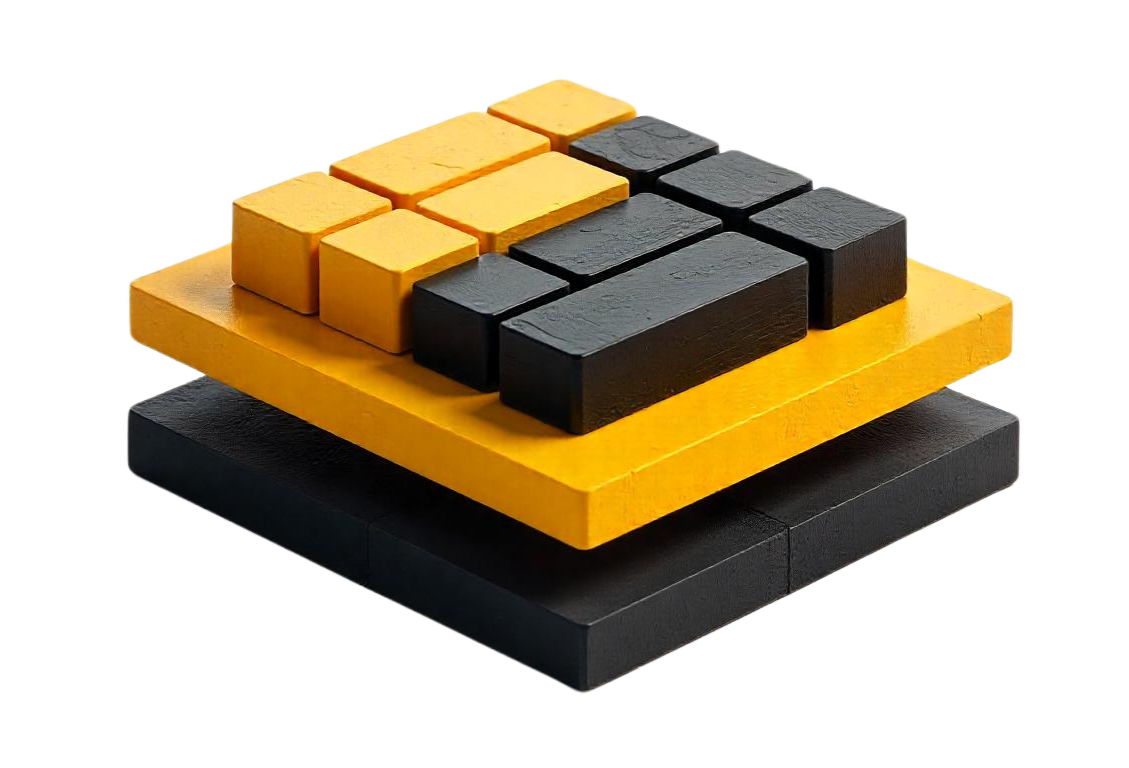
Skin
The Skin defines the rendering logic for the component. It is responsible for the visual appearance and layout, allowing developers to customize the user interface without altering the underlying behavior. Skins can be swapped seamlessly, enabling the same component to adapt to different design requirements or user preferences.
Every component you need is ready for production
Build at an accelerated pace without sacrificing flexibility or control.
Paradigm
Building robust and maintainable software requires a thoughtful, disciplined approach to design and implementation. At Qbit, we follow core programming principles that promote clarity, scalability, and efficiency. Our development paradigm is grounded in SOLID principles, which ensure modular, flexible, and maintainable systems by focusing on single responsibilities, extensibility, and strong abstractions. We embrace DRY (Don’t Repeat Yourself) to keep code concise and avoid redundancy, while also recognizing that in certain situations, WET (Write Everything Twice) can speed up practical solutions. Above all, the KISS (Keep It Simple, Stupid) principle guides us to prioritize simplicity, creating clear and easily understandable solutions.
Features and Comparison
Component Base Architecture
Clear separation of logic (Shell) and presentation (Skin).
Dynamic Skins
Skins can be created, swapped, and applied at runtime for unparalleled flexibility.
Customization and Extensibility
Support for user-defined Skins and extensions.
Performance Optimization
Streamlined by separating behavior and rendering.
Balanced Abstraction
Combines DRY and WET principles to enhance clarity and maintainability.
| Feature | Qbit | MUI | Chakra UI | Ant Design | Tailwind UI | React Bootstrap |
|---|---|---|---|---|---|---|
| Scalability | ||||||
| Maintainability | ||||||
| Customizability | ||||||
| Extensibility | ||||||
| Performance | ||||||
| Adaptability |